Client: Mural Muse
Mural Muse is more than just a mural painting business—it’s a creative journey that transforms blank walls into works of art. When designing the branding and website, I wanted to capture the essence of my mural work: bold, graphic, and playful, yet refined and purposeful.
From the typography to the color palette, every design choice reflects the vibrancy and energy that I bring to my mural projects. The logo combines structured, geometric letterforms with a fluid, hand-drawn element—mirroring the balance between precision and artistic expression in my work.
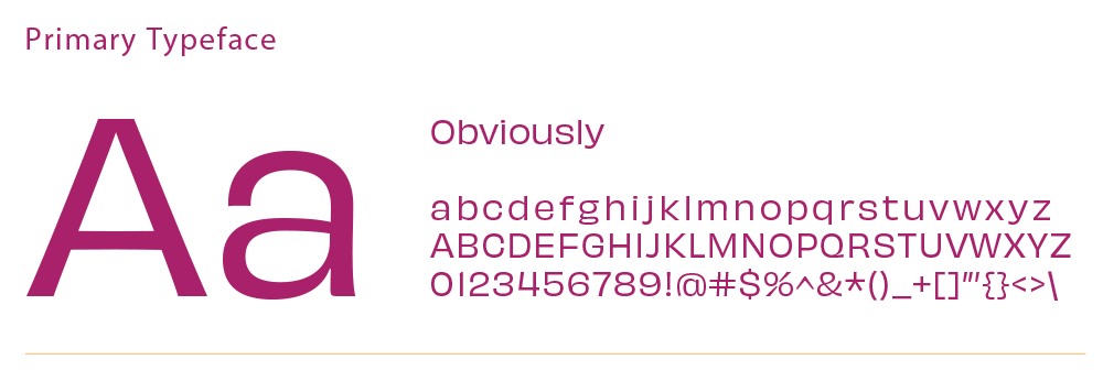
Typography: The logotype is inspired by retro signage and dimensional letterforms, with deep shadows and striking angles that add depth and movement. Paired with a free-flowing script, the brand feels both structured and organic.
Color Palette: A rich, warm palette of golden ochre, deep plum, and vibrant magenta gives the brand a sense of energy and sophistication.
Patterns & Graphics: The use of triangular patterns and modular designs adds a playful edge, reinforcing the hand-painted, crafted feel of the murals themselves.
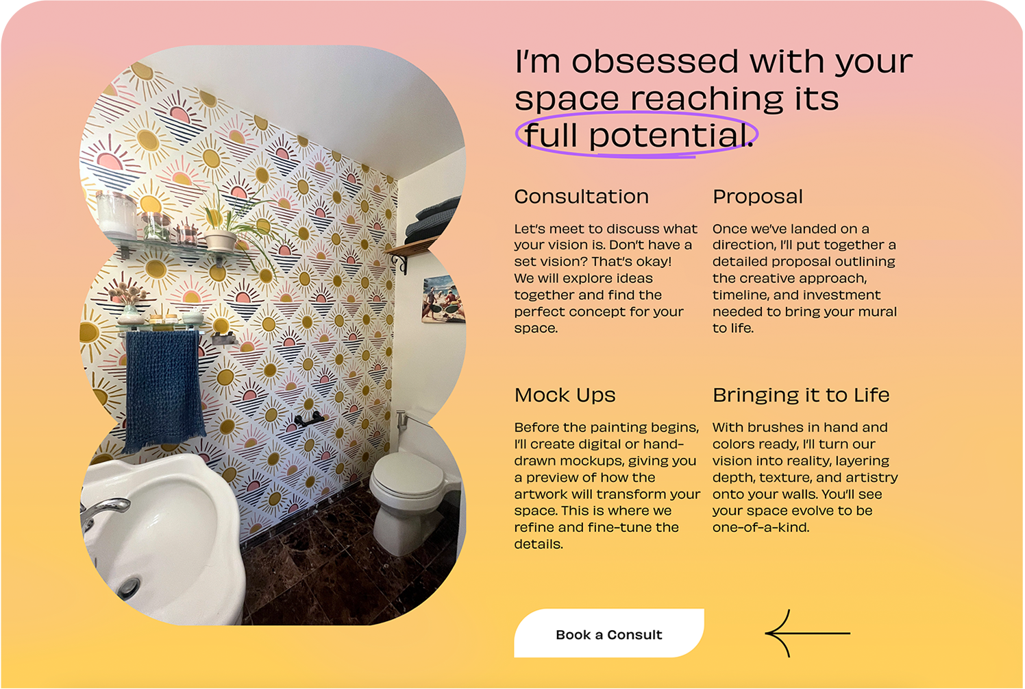
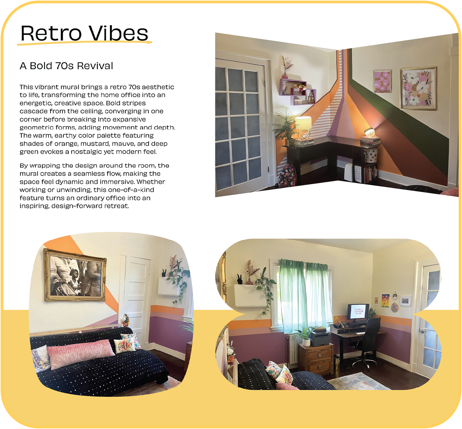
Website Design: The website follows a clean yet dynamic layout, incorporating layered elements, unexpected shapes, and engaging typography to guide the viewer’s eye. It tells a visual story, inviting potential clients to envision their own spaces transformed with art.


